Create a game interface
Open your project and choose Features → UI Authoring to enter the UI workspace.
The workspace has three main editing areas:
- UI Nodes and Hierarchy on the left, for adding elements and organizing their parent-child relationships.
- The central UI canvas, where the document is previewed and elements can be selected and positioned.
- UI Properties on the right, for changing the selected element.
Start with a simple main menu: a background Panel, a Text heading and a Button.
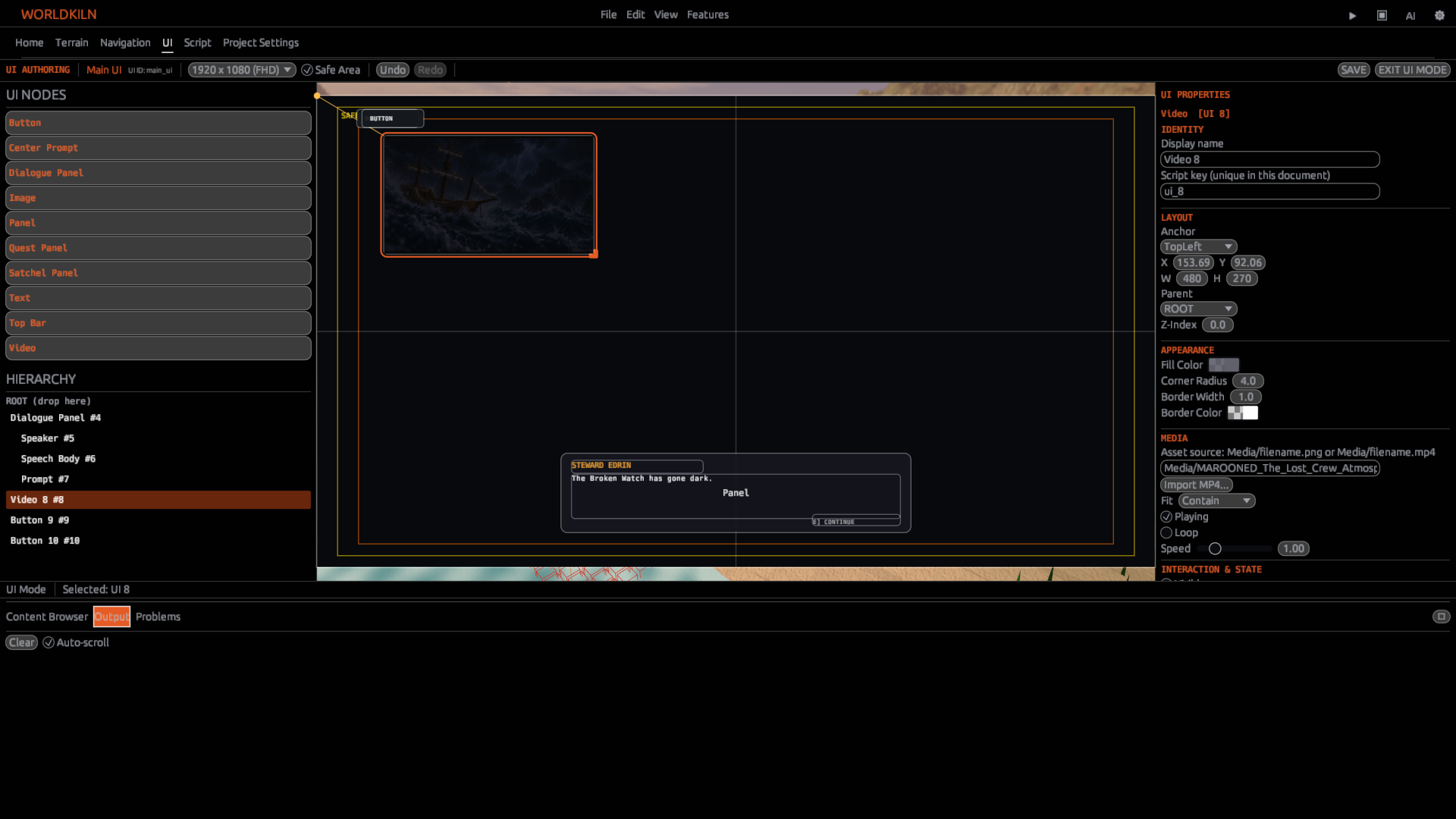
Add elements
In UI Nodes, choose an element to add it to the canvas. The UI asset list also offers available saved UI assets and built-in presets. Select a node in Hierarchy or directly on the canvas to edit it.
Common element types include:
| Type | Use |
|---|---|
| Panel | Backgrounds and groups of controls |
| Text | Titles, instructions and status labels |
| Button | Clickable choices and actions |
| Image | Imported pictures and interface art |
| Video | MP4 clips and cinematics |
Select a Panel for the menu background, add a Text element for the title, then add a Button beneath the title.
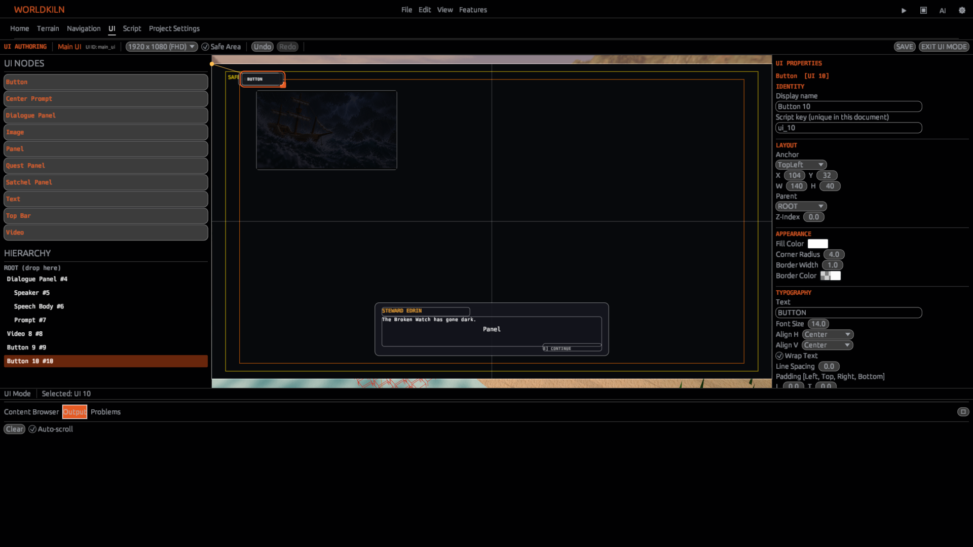
Lay out and organize the interface
With an element selected, use UI Properties to change its position, size and appearance. Use the canvas to check the result.
Position and anchors
Position and Size describe where a control appears and how much space it occupies. Anchor controls the point the position is measured from. For example, TopRight places a control relative to the upper-right corner. Stretch uses margins to size an element across its available parent area.
Use Z Index to control which overlapping element appears in front. Color, border and corner-radius properties can help distinguish background Panels from interactive controls.
Hierarchy and parenting
Drag nodes within Hierarchy to organize them beneath a parent Panel. Use ROOT (drop here) to return a node to the document root.
When you move a parent, its children move with it. Select the child directly when you want to adjust its position or styling.
Text layout
Select a Text or Button element to edit its text. Adjust font size, horizontal or vertical alignment, wrapping, padding and line spacing from the available typography properties.
Make a Button interactive
For your Button, set its displayed label to Start and give it the Script key start_button. A Script key is what AeoScript uses to find the control.
Create the project script scripts/menu_click.aeo:
const start = ui.find("start_button")
if start != nil {
    start.on_click = fn() {
        debug.log("Start clicked")
    }
}
Save the UI document and script. Start Play, click the Button and look for Start clicked in Output.
Bind a Button to a handler
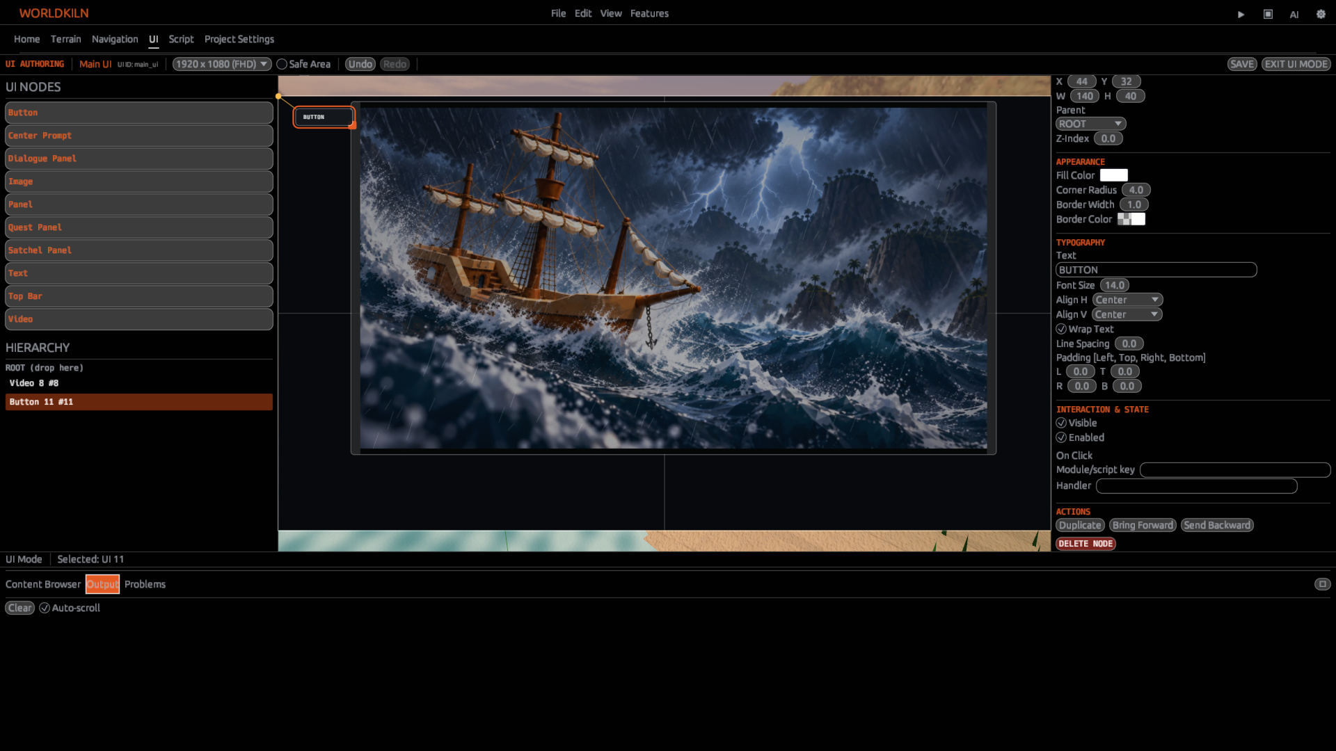
An authored Button also has an On Click event binding with a Module/script key and Handler field. Use these fields when connecting the Button to an existing script handler in the UI editor. Test the binding in Play and inspect any reported validation errors.
See Creating Your First Game Interface for the standalone script walkthrough, and UI APIs for individual properties.
Add images and video
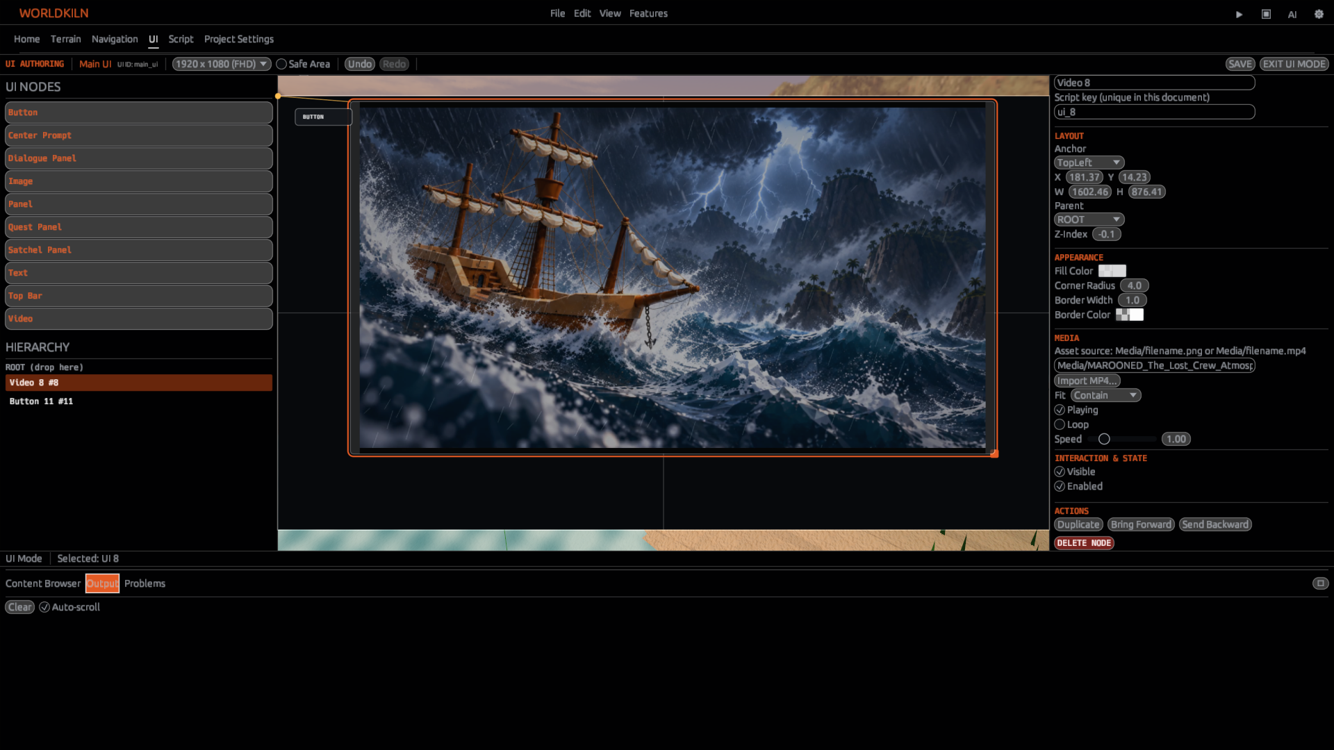
Add an Image or Video control and select it. In the Media properties, choose or enter the project media source and set Fit to Contain, Cover or Stretch.
A Video control also exposes Playing, Looped and Playback Rate. You can use Import MP4... for a local video file.
For a scripted Video:
const clip = ui.new("Video")
clip.size = [640, 360]
clip.source = "Media/intro.mp4"
clip.fit = "Contain"
clip.playing = true
Use the Media guide for importing images and videos.
Preview and save
Check your UI at the available preview resolution, then use Play to verify visibility, layout and clicks. The UI Properties panel includes validation messages for issues in the authored document.
Save the UI document and reopen it to confirm that its elements, keys, parent relationships and layout remain intact.
Next: UI APIs, Media, and AeoScript UI.